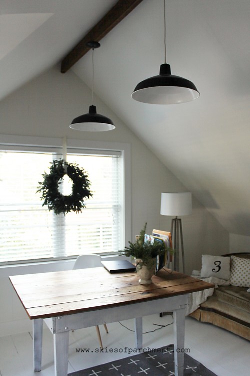
We have been so enjoying the renovated attic for almost four months now, and I’m excited to share this last part of it!
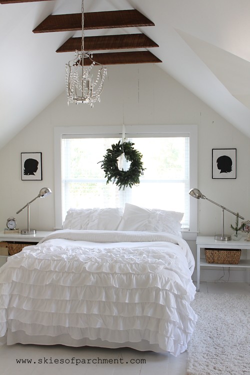
As I’ve talked about before, all three kids shared a bedroom until this attic renovation, which worked (you do what you have to, right?), but it has been SO wonderful to have a bit more space and be more organized now! The two girls have moved upstairs to the new bedroom.
I did tell them that I would be so happy to trade with them; they can have the master suite and Ben & I will take the new attic bedroom, but they were happy to stay in their new room. :)
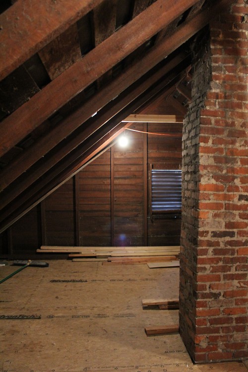
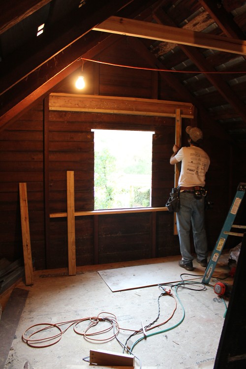
[Before]
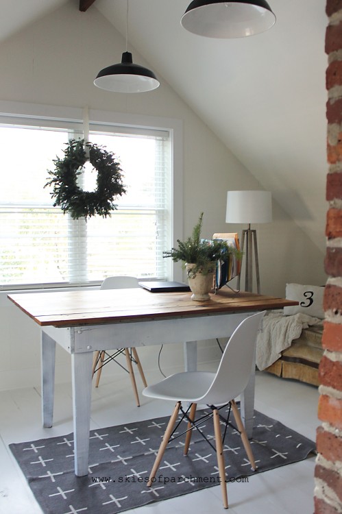
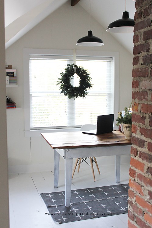
A brick chimney from the kitchen and dining room came up through the middle of this room. Thankfully, the fireplaces were already not functioning, so we were able to take down the bricks to the floor level without disturbing the looks of the kitchen and dining room fireplaces.
We also put in a beautiful big window where there was only a wooden vent before.

[ After ]

This room turned out almost as I had pictured in my mind; only, better. As with the office, I was inspired by whites, clean empty space, and Norwegian-style simplicity. I don’t know that I nailed the beauty of the Norwegian style , but I have loved this darling space!
There is something about the white that is so refreshing, and makes my whole brain feel clean. I love to come up in the office to do my emails and business. I love to snuggle with the girls in their bed at night or in the morning. I think I could live upstairs if someone would only bring me food. Personal chef, anyone?
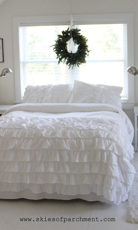
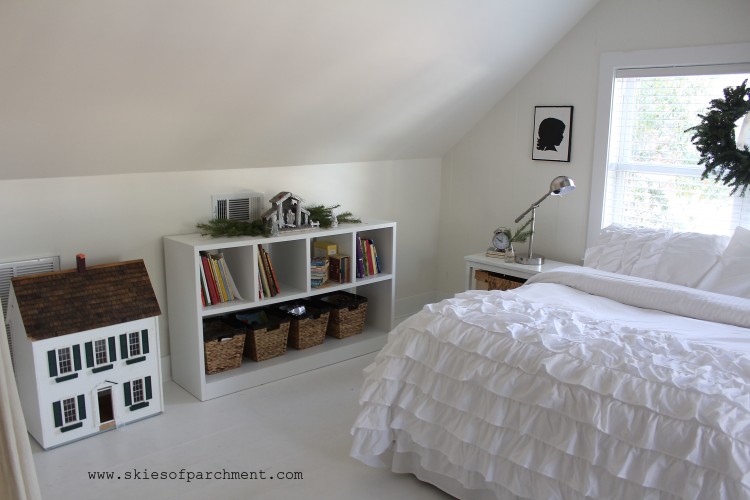
For the bed and bedding, I chose just a bedrail underneath with no headboard or footboard. The window serves as the headboard, and the shams and bedspread are the perfect accent piece to bring a bit of elegance to the room.
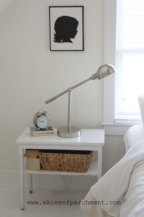
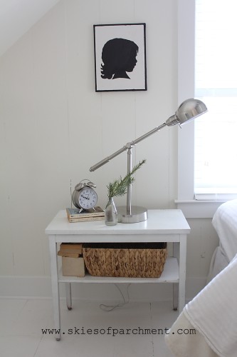
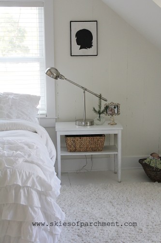
The end tables were found at a local antique store, and I spray-painted them white. I wanted a touch of modern in the room, and after looking everywhere online and in stores, I finally found lamps like I was wanting at Lowe’s, of all places, and they were the most reasonably priced I’d seen too. The baskets are the perfect catch-all for the dozens of papers and pens and Little Tiny Objects that little girls just seem to collect like magnets.
Ben made this piece for me, inspired by a similar design from IKEA. IKEA sells them inexpensively but we live far from one, and shipping would have brought the price to a ridiculous amount. There are amazing perks to have a husband who can create anything with wood. :) This is one of them! It houses books in the little boxes, and toys, stuffed animals, and games in the baskets underneath.
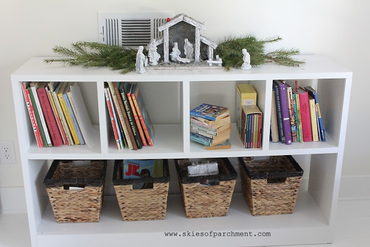
[obviously these pictures were taken at Christmastime :) ]
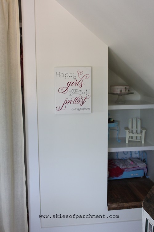
This little corner was Ben’s idea. Rather than having a long closet with difficult access to the end of it, the closet was cut a bit shorter and this nook created. The girls love it. It’s become like a little dollhouse with beds and rooms and furniture set up.
(artwork from Aimee Weaver Designs ♥)
There is no door on the closet. This was intentional, giving more space to the actual room because of not having a swinging door. I love the touch of texture that the curtain panel gives to the room.
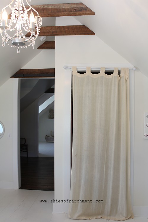
Aren’t these beams beautiful?! I swoon.
They are not original beams, although they are original wood used from the attic.
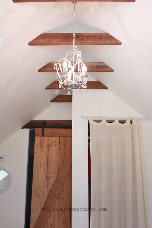
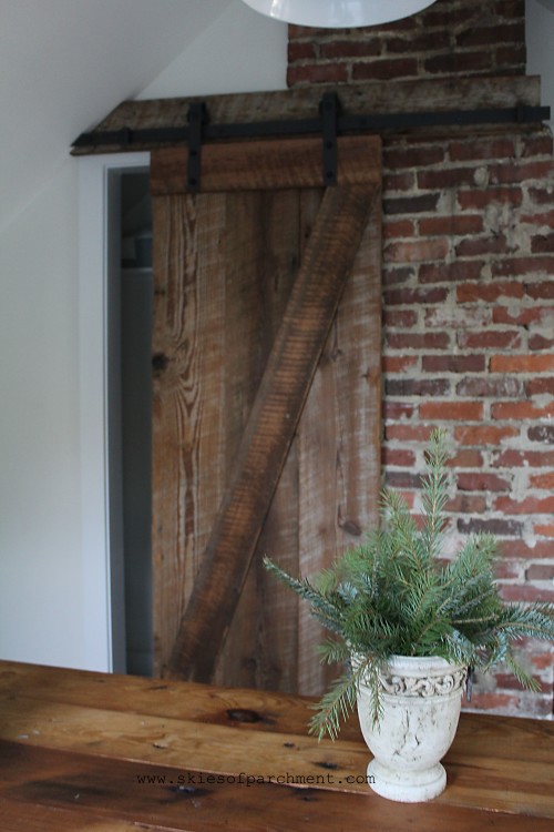
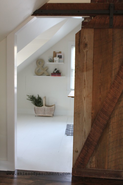
Another sliding barn door is in this room, used for the bedroom door. I swoon again.
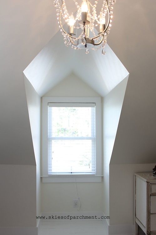
The bedroom has a cathedral dormer window as well, which was my brother-in-law Chris’ idea. I love it! The cathedral style adds such character, rather than a flat-topped dormer. We kept the knee-walls fairly low outside of the dormer for the illusion of more space. It’s just a head-banger if we’re not careful. :)
Ben humored me again with having white floors, and white walls, and white ceiling…. white everything. He is so kind to me, going along with my ideas so much of the time, and then coming up with so many great ones of his own. He is the brain behind the structural design of the remodeling we’ve done. This attic was just one giant room, that he created three rooms from (office, bedroom, and foyer). I can hardly believe this is the same space; it is just SO beautiful!
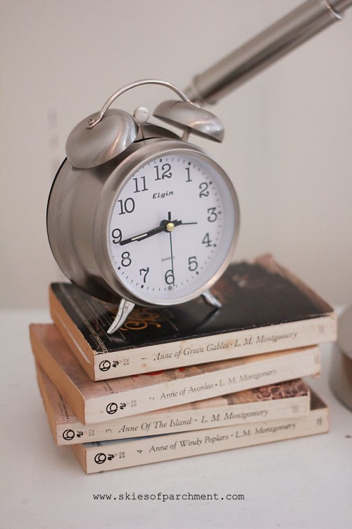
The room is very simple and understated, but here are a few of my favorite little touches…

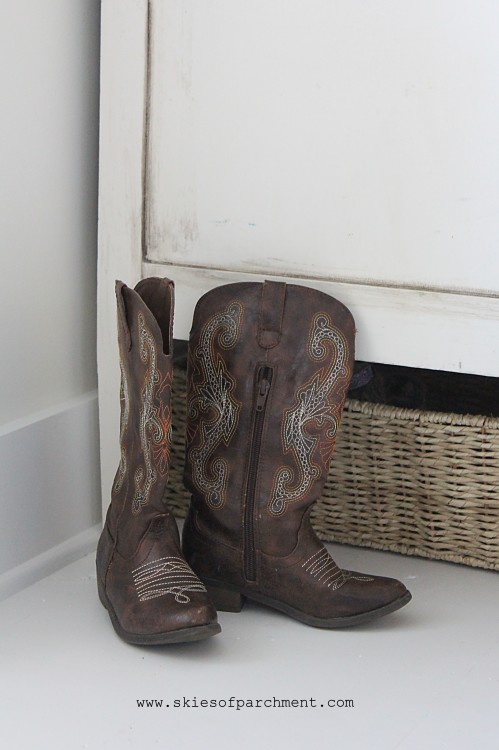
Funny story about the ‘simple and understated’: Zoe was so excited when she learned that she and Olivia would be sharing a room, and having a GIRLS’ room. She immediately began dreaming of all the COLORS (!!!) she wanted in there.
“Red on the ceiling! No, actually, red and white STRIPES! And I want aqua and lots of color!
I felt a little guilty, because well, a little girl does like color, and here I was going with not only limited color but NO color except white, so I told her that, “Sweetie, you know what? It’s actually going to be a white bedroom, because it’s in an attic, and red and white stripes just won’t really look good up there.”
“WHAT?! A white bedroom? I don’t want to be a little girl that looks back on my childhood and has a WHITE bedroom. I mean, white doesn’t even mean anything. I want something with color, and especially RED. It would be soooo boring to have a white bedroom!”
I don’t know what she was picturing, but clearly she and I were envisioning completely different things. I was beginning to feel like a terrible mother in forcing my child to have a terrible childhood and have a white bedroom, or all things!!
After the room was completed, however, she came to me with a sheepish grin and said, “Mommy, it’s okay if my room is all white. I actually REALLY like it.” :)
And a few weeks later when we bought her a red winter coat, she said that makes up for the red stripes in the bedroom. Whew. At least we got that covered.
Seriously though, I love to be a steward of that which Jesus has entrusted to me. My home is my little spot on earth’s surface, and I love how Edith Schaeffer says it:
“A Christian, who realizes he has been made in the image of the Creator God and is therefore meant to be creative on a finite level, should certainly have more understanding of his responsibility to treat God’s creation with sensitivity, and should develop his talents to do something to beautify his little spot on the earth’s surface.”
― Edith Schaeffer, The Hidden Art of Homemaking
Sometimes, in a world of ISIS terrorism and starving children and four blood moons, I stop and wonder why I even care about pretty things or home renovations, or why a beautiful new arrangement makes me so excited, or why I’m so passionate about helping people to better health. I DO care about the first mentioned things, but I also care about seemingly small things.
And then I remember… just because I love the sight of a freshly made bed, or cry happy tears at an email with good health news, or get giddy at before & afters, it doesn’t make one less spiritual. It is learning to see the beauty of God in the middle of a broken world, and taking notice of these things is actually worshipping Him and thanking Him for the ways we see Him. Edith Schaeffer says it beautifully again:
“If you have been afraid that your love of beautiful flowers and the flickering flame of the candle is somehow less spiritual than living in starkness and ugliness, remember that He who created you to be creative gave you the things with which to make beauty and the sensitivity to appreciate and respond to His creation.”
Responding to and appreciating His creation… with the goal of bringing Him glory: that’s what I want to do.
Happy Hump-day, Lovelies!

Sources:
Desk Lamps: Lowe’s, Allen + Roth
White Waterfall Bedspread and shams: Ebay, similar here (they must have been running a special the day I purchased, because I paid less than half the price for the one I found)
Wall and ceiling color: Dove White, by Sherwin Williams, eggshell finish
Floor color: White Exterior-grade paint
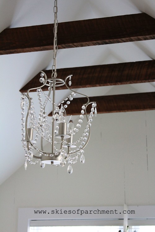
Chandelier: IKEA, purchased from Ebay


