This house has been a dream come true for me. After renting a rather dark and what felt like gloomy house for almost four years, I have been so delighted to actually have our own little home! Yes, it’s little. Only two bedrooms, about 1500 square feet altogether. It’s little. But it’s oh, so cozy. And so full of natural light! I LOVE that. And there is no landlord that says what we can or can’t do. :) Poor husband, now that his wife is let loose!
I felt really stifled in that rental, but you know, I think it was really good for me. For one, it makes our own house so much more special. And two, I think I learned creativity and contentment in a whole new way at the rental house. It wasn’t a natural cute house, so it took a lot of effort to make it cute, without pointing out all the unattractive things about the house. It was a real stretch especially in being content. I can’t say that I mastered that area, but I do feel like the Lord really helped me grow in that. And I keep growing even now.
I think the kitchen in our new house is one of my very favorite rooms. Yeah, well, they’re ALL my favorite. :) But this is especially a favorite. A lot because our rental house had a very very tiny galley kitchen in the middle of the house – no windows, only an overhead florescent light, and if more than two people were in the kitchen it felt overwhelming.
My new kitchen still isn’t large, but most standards. But to me, coming from a teeny kitchen previously, it feels HUGE!
First impressions, though, weren’t very pretty. It was almost the exact colors that were in our rental. Yuck!
BEFORE:
In the middle of January, in 30′ weather, this was very depressing. I had a hard time seeing potential in this place!


Brown and yellow put together may come back one day, but I dare say it will not be for me.
We tore out some walls in between the kitchen and dining room and living room. It made the front of the house seem twice as big, and so roomy and spacious. The kitchen was probably the most work out of any other room in the house.
THIS was my kitchen inspiration photo. I think it came from Better Homes & Gardens. My colors and basic theme came from this.

Of course there are differences that and MY kitchen – they are two totally different houses! So here’s my version… That cool flooring went in a bathroom instead of the kitchen.
So this is AFTER!
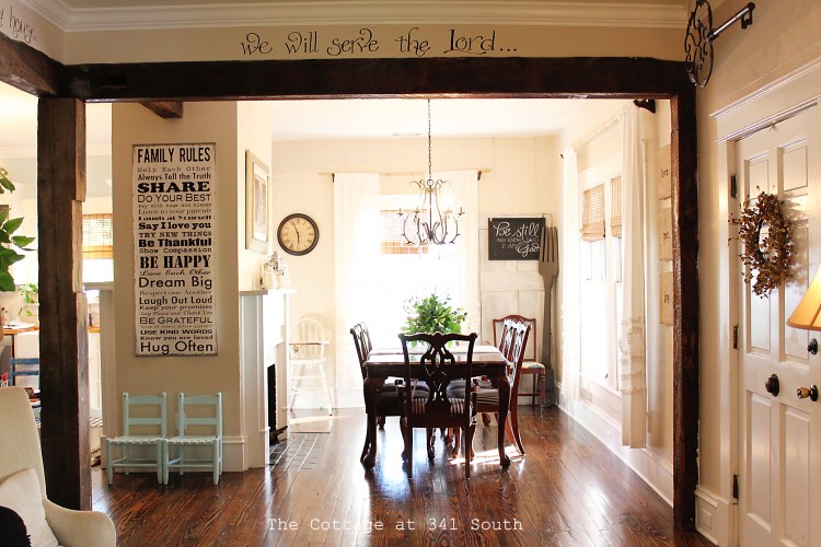
Entering the kitchen from the living room and dining room… Ben added these beams, which came from an old house locally.

The hardwoods were refinished, along with the rest of the house. I love the painted floor look too, but it wouldn’t have worked well with our open floor plan.
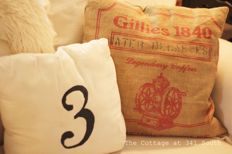
I made these 12 X 12 burlap squares, thinking they would go by a fireplace, but they seemed to fit here. These are words that describe what I want our home to be like: lots of love and affirmation, peace and comfort and rest, and lots of fun and joy.

The chalkboard in the kitchen was an idea I had wanted since years ago – partly for looks, because I think chalkboards are awesome, despite their ever-growing popularity, and partly because supper time can often be a crazy time of day at our house, and I thought this would keep the girls entertained instead of following me around every inch of the kitchen.
If you look on the first picture, it says, “Let’s celebrate Ben!”, from his party back in August. (see how long ago I shot these pictures?) But it’s covered in little scribbles. So yay, my hopes for this area being child entertainment are fulfilled!
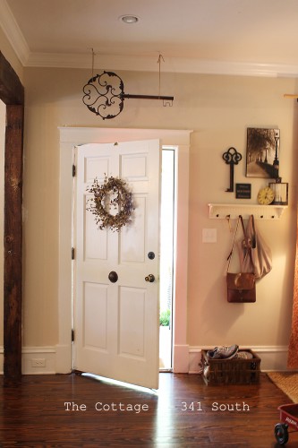
Plus, it’s one of the first things you see upon entering the front door, so it makes a fun way to welcome guests!

For the top of the chalkboard, I dry-brush painted two metal grates that I had found at an antique shop years ago, then tied jute string from one end of the other and clipped pictures of our friends onto it, wash-line style.

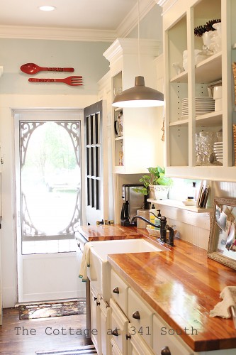
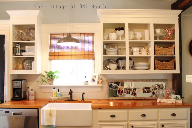
Entering the kitchen a bit more… Having a window above my sink is dreamy!
And can you believe that Mr. Husband surprised me with this apron-front sink?? I could scarcely believe it when he told me. This is what I really wanted in here, but gracious, they’re expensive. So this is my birthday and Christmas and birthday and Christmas and birthday and Christmas gift for the next decade. :) We tried to justify the $$ because we really didn’t spend that much on the rest of the kitchen. :)
Ben added crown molding on the ceiling, and also on the top of the cabinets to make it look like staggered heights. This side is existing cabinetry, with the doors removed on the top half. We did order all new doors for the kitchen. [side note: we ordered them online instead of in-person, and they were way too “fussy” in real life. I would have preferred something a bit simpler had I known].
The chandelier was a $7 auction find.

A close-up of the apron-front. I love this baby! Not only does she look lovely and old and vintage-y…

… and fit so well with the butcher block counter top that Ben made out of old 2×4’s out of walls torn out of the house [isn’t that just precious??]…

… but it was perfect for bathing little children before the tub was hooked up…

… and it’s a perfect height for a little girl who loves to wash lettuce and is always asking to help in the kitchen.

One more peek at her. :)

Quite frankly, there is nothing I don’t love about this sink!
I chose the rainy-day blue color because I wanted a cool-feeling kitchen. The color is “Kittery Blue” in eggshell finish from Benjamin Moore, but we mixed pure white with it as well to soften it – the color was too bright blue for me.
It is so hot so much of the year where we live, and i didn’t want a “hot” color to where i’d feel like i was roasting along with my dinner. I think this is the reason I chose cooler colors throughout most of the house, which is quite unlike me, really. I have always loved COLOR. And now I still like color, but more splashes of color than rooms of color. Even though I still people’s bright colors and think to myself how lovely it looks and perhaps i should have done that too… :)
Details in the window cupboards… Wanting it to feel cozy, not sterile (though definitely clean!).
I love my open cabinets. It feels so comfortable. Not sure why, but it does. And guests know where my glasses and everything are. No opening five cupboard doors before finding the right one!
My open cabinets were inspired by The Lettered Cottage and A Country Farmhouse in particular, and a few other magazine sources.

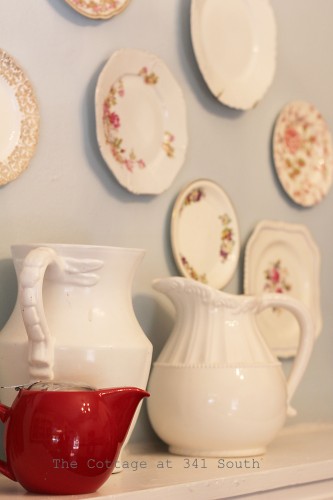
I had so many white/silver/glass dishes, so I didn’t go out and buy many at all. I did add a few little things I found for a dollar or two at junk shops.

Fun little cups I picked up at my favorite little junk shop. These are our chocolate milk glasses. :)

These are my fave. So sweet and cute.

This mirror was randomly placed here soon after we moved, when we tried to clean up the house one day to get ready for guests. And what do you know, but I really liked it there. So it stays! I dry-brush painted this gold frame, and I love how it made the molding stand out. This is also my little picture board while I’m washing dishes. Seeing happy faces while I’m cleaning up seems to make the job happier!


This reads, “peace. It does not mean to be in a place where there is no noise, trouble, or hard work. it means to be in the midst of those things and still be calm in your heart.” [unknown] I so often need this reminder!
A container [found at Goodwill – does anyone even know how much I love Goodwill??] filled with glass vases. Sometimes this is emptied out and used at a salad bowl for company. And sometimes the vases are gone and scattered all over the house, holding various flower arrangements and buds.

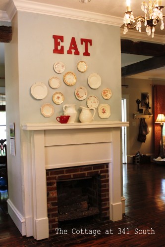
And the third fireplace of the house is in the kitchen. Believe it or not. I can’t wait to use it in the winter! I think I will actually like cooking and baking then!

Little girl who follows me around the house while I shoot pictures. :)


And another look I’ve had on this mantel. It’s fun to change it around a bit, but I know I will not be one of those people who changes their mantels every single season. Because, with 5 fireplaces, that would be 20 different mantel-scapes, and I know is not going to happen here!


My baking corner. Pretty much all I need to bake with (pans, mixing bowls, ingredients, beaters, refrigerator) is within arms reach.

Ben also made this concrete counter top. Yeah, he can do pretty much anything he sets his mind to. It all started when we began pricing new counter tops, and were blown away with how expensive they are! My ever-frugal husband began thinking of alternatives to the classic counter tops, and decided to experiment with this. The only cost was a few boards to frame up the counter top and the concrete to pour in it. Very very inexpensive.
People that make concrete counter tops as a business must have formulas and things for different colors. We didn’t, so it was pure experimentation. He added some black dye in the concrete when he first made it, but it only turned it a light grey, and we both wanted a charcoal color. So he rubbed ebony wood stain on top after it was dry, and then sealed it. It turned to the perfect color. I think he’s a genius. :)
Now that we’ve lived with it for a while, I still LOVE it. However, we would go with grout sand rather than concrete sand. It would make a smoother finish.
We searched online for “DIY concrete countertops” and found various blogs and tutorials.
I love the practicality of it as well – my pans can come directly out of the oven and be set on the counter.

Ben took away the old yellow vinyl and replaced it with beadboard. I really like this look.
Bamboo and white tongs in one jar, black and stainless steel in another. I’m funny about that.

A flat-top stove! Very, very exciting after my vintage model at our rental. :) I kept trying to tell myself that “Hey, vintage is cool!” but I wasn’t able to convince myself. A flat-top feels so clean and I have been loving it! We did get all new appliances in the kitchen.

Can you believe that my dear friend Linda found this at a yard sale for TWO DOLLARS, and GAVE it to me?? I couldn’t believe that she didn’t keep it for herself!

And now after seeing my perfectly clean kitchen, looking like it’s never used, I’ll clear up that illusion and tell you that this is what it looks like quite often. Almost daily, in fact. Except without the cookies.
Ben made these cabinets on this side, but we ordered doors.

And now you know that I live in a real world. :) Yes, I realize it does not look safe for my children to be on the counter. But if you only knew how happy they are to be up there with me, you’d allow it too. And yes, I do stay close by. Except when taking pictures. :)
Once more, before:


And
After!

[I think a round jute rug would look so very cozy right in the center of the kitchen, but where do I find one for super cheap??]


Thanks for taking my little long tour!
~clarita
Sources:
Farmhouse Sink: signaturehardware.com
Blue wall color: Kittery Blue; Benjamin Moore, in eggshell, mixed half/half with pure white trim paint [edit: this is discontinued. the closest thing I could find was ‘Harbor Fog’ by Benjamin Moore. This Harbor Fog would not need to be diluted or altered; it’s the closest match to the finished wall color that I could find.]
Butcher Block Color: Waterlox (a food-grade sealer), multiple coats, no poly
I’ve gotten a lot of questions about the butcher block countertop through messages, so I’ll answer a bit here:
The kitchen butcher block countertops are made from reclaimed Antique Southern Pine. We then used only Waterlox, multiple layers (like 4-6!) because poly isn’t food-grade safe. The Waterlox does give a water-proof sealant, and also a bit of natural color although it’s not considered a stain. We didn’t use any color/stain on the countertops. The amber color came because of the Antique Pine and combination of Waterlox.
Cabinet color: Dove White, by Sherwin Williams
Floor Stain: Dark Walnut; Minwax
Cabinet doors: cabinet door world
Like this:
Like Loading...
